
Share this
Two Colours, One Room: Designing the Kitchen at Scallop House
by Imran Jahn on Sep 28, 2026
An open-plan kitchen is rarely a blank slate. In most London homes it is where the original house meets the new extension, where Victorian proportions run into contemporary glazing, and where a family's busiest hours play out. At Scallop House in Stoke Newington, we have started the concept design for the kitchen and dining space. We think that meeting point shouldn't be hidden. It should be celebrated.
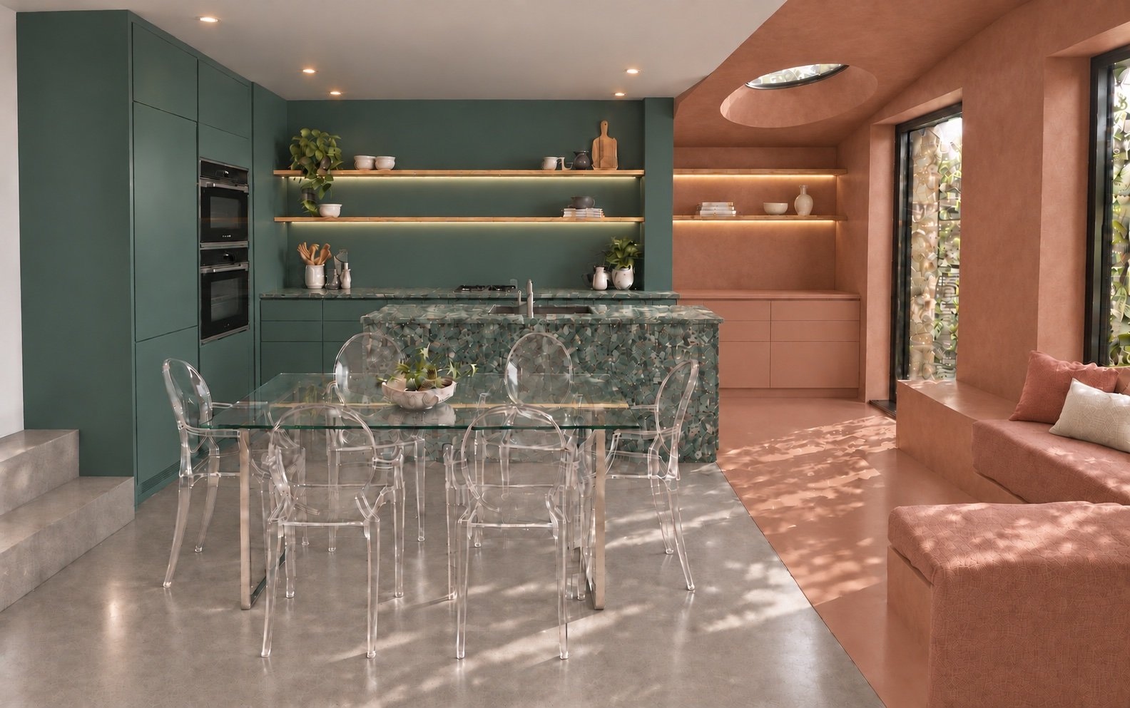
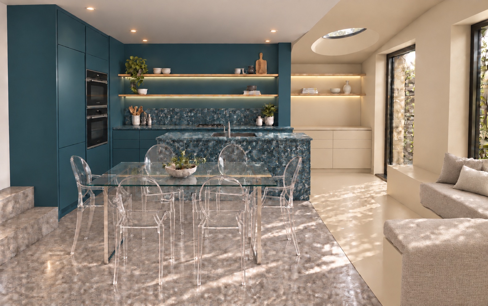
Mineral green and warm terracotta test an earthy pairing, with the island adding texture to the kitchen zone.
The idea: let the old and the new speak
Our central move is simple. We use two bold, complementary colours to define the two parts of the room.
- The original house holds the working kitchen: tall units, open shelving and the cooking run, all in a single deep, enveloping tone.
- The new extension holds the softer, more social space: a built-in window seat, low storage and a sculpted ceiling with a circular rooflight. It is wrapped in a lighter, warmer partner colour.
The colour doesn't stop at the joinery. In the extension, it runs across walls, ceiling and floor, so the space reads as one continuous, crafted volume. The effect is less "painted room" and more "carved room". The curve of the ceiling and the pool of daylight from the rooflight become the defining features.
The result is an open-plan space that still has a clear sense of place. You always know where the house was and where it has grown.
Eight pairings, one conversation
We prepared a series of concept visuals testing eight colour pairings on the same design:
- Deep Olive + Dusty Rose
- Aubergine + Pale Sage
- Indigo + Ochre Clay
- Forest Green + Soft Lavender
- Mineral Green + Warm Terracotta
- Burgundy + Plaster Pink
- Deep Blue Green + Coral
- Deep Petrol + Oatmeal
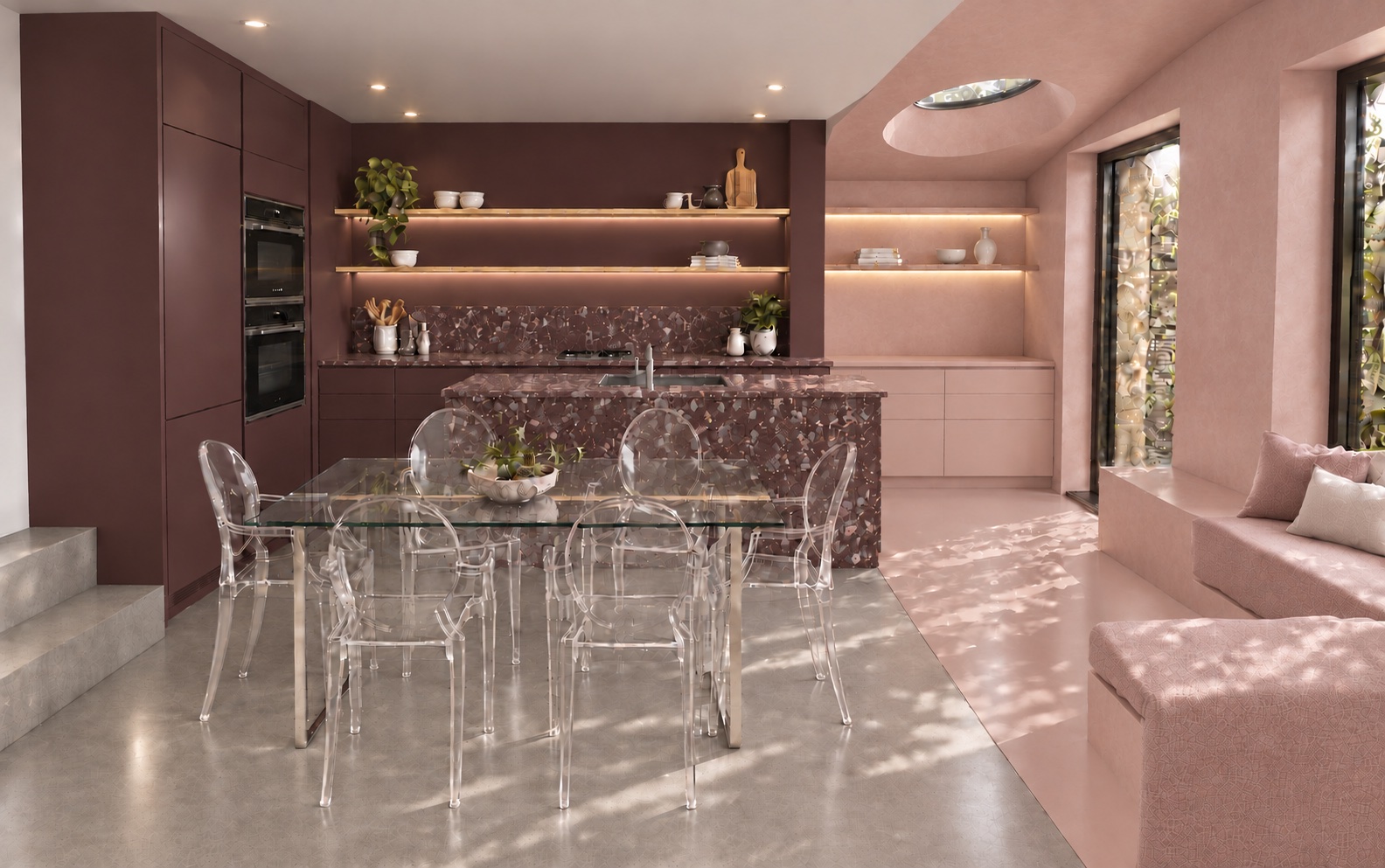
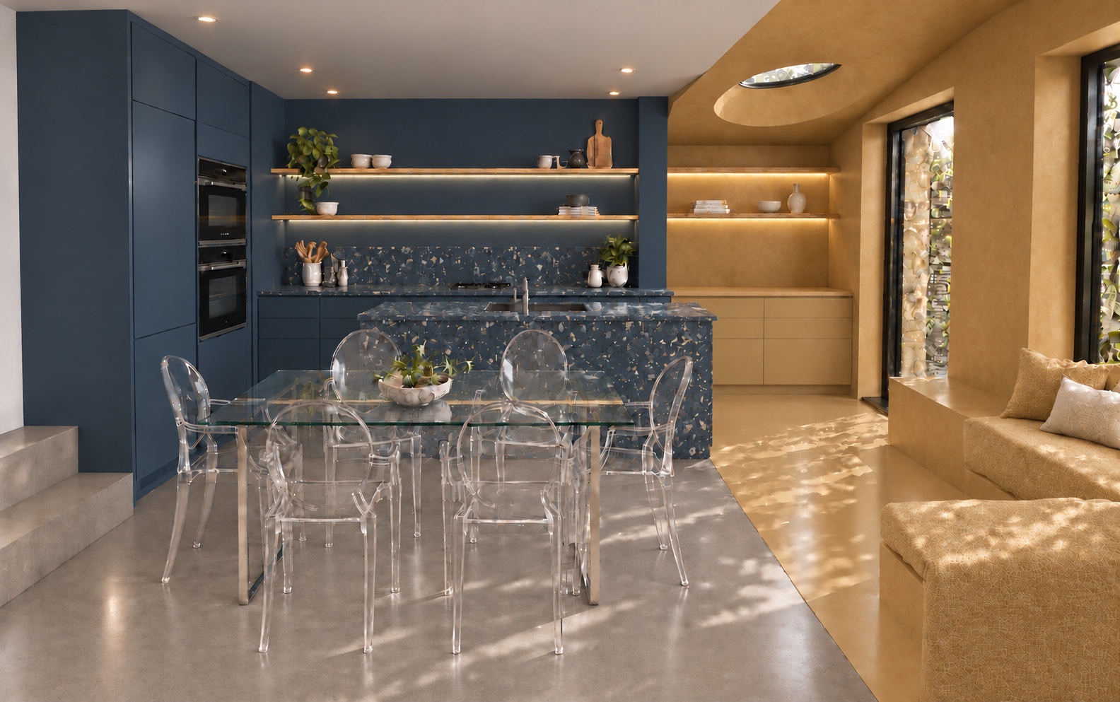
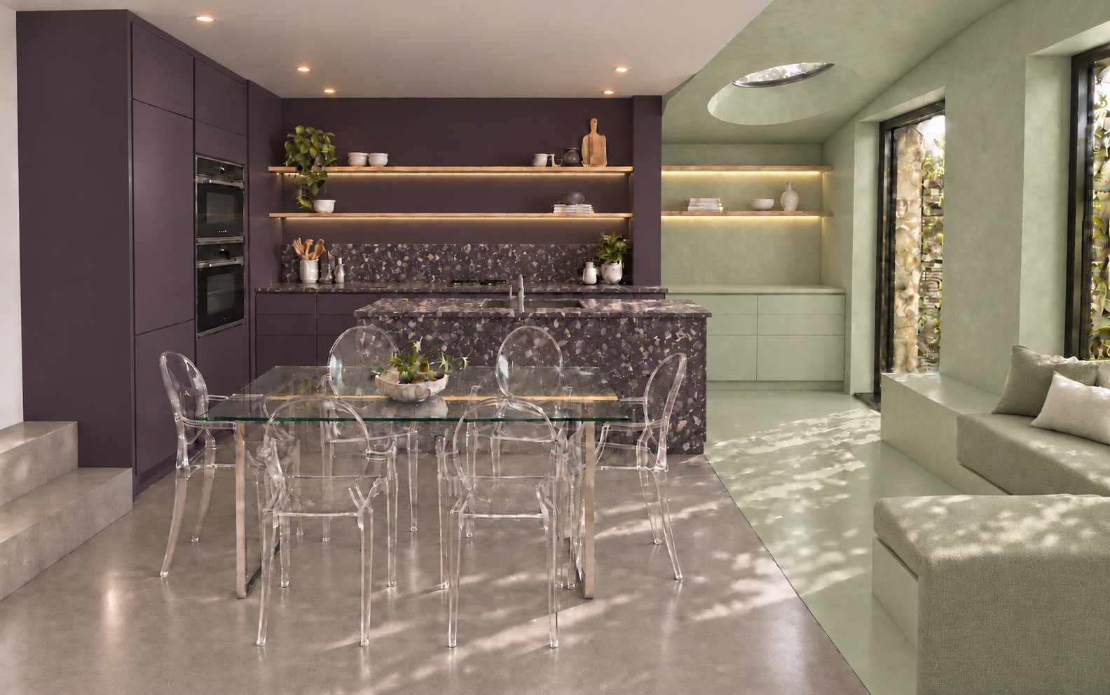
Showing the same space in eight different moods changes the conversation with a client. The question moves from "what colour do you like?" to "how do you want this room to feel?"
- Deep Olive + Dusty Rose feels grounded and warm.
- Indigo + Ochre Clay feels like late summer light.
- Deep Blue Green + Coral is confident and playful.
- Deep Petrol + Oatmeal is calmer and more restrained.
Each pairing works because the two colours carry similar weight in different ways. One is deep and saturated, the other is softer and mineral. Together they create contrast without conflict.
Seamless surfaces
To achieve the wrapped, continuous finish in the extension, we are exploring microcement, with Topcret as our proposed supplier for the wall, ceiling and floor finishes. It is a jointless finish that can run up walls, across floors and around curves, and it can be tinted to almost any colour.
In the original part of the house, a grey microcement floor anchors the kitchen and dining table. It also creates a quiet threshold where it meets the coloured floor of the extension. That line on the floor does the same job as the colour change on the walls: it marks the junction between old and new, with no need for a door or a step.
The island as an object
We think the island deserves to stand on its own. Rather than treating it as another run of cabinets, we have shown it clad in terrazzo on all sides, like a solid block of stone set into the room.
Terrazzo suits this role well:
- It is durable and forgiving in a hard-working kitchen.
- Its aggregate can be tuned to the colour pairing, so each scheme has its own island.
- It brings texture and depth that paint alone can't.
Around it, a glass dining table and Kartell Louis Ghost chairs keep the sightlines open. The island and the colour stay in focus, and the room feels larger than its footprint.
Design meets reality
Concept visuals are a starting point, not a specification. Our first images showed stacked ovens in a tall unit. As we developed the layout, it became clear that this position is needed for the fridge freezer, so the ovens are likely to move below the worktop.
This is exactly why we test ideas early. A good kitchen is a balance of three things:
- Atmosphere: colour, light and material
- Workflow: the practical relationship between prep, cooking, washing and storage
- Integration: appliances, services and extraction, coordinated with the contractor from the start
The workshop: getting the detail right
The next stage is a design workshop with our clients and the contractor. Before it, we ask clients to think about the decisions that shape how a kitchen works day to day:
- Island finish: cabinet and worktop materials
- Worktops and splashbacks
- Hardware: knobs, handles, or a handleless design
- Storage: bins, trays, larder, spice racks
- Appliances: ovens, dishwasher, hob, fridge freezer, microwave
- Sink and taps: sink type and size, and whether a boiling water tap is wanted
- Extraction
- LED lighting: including the warm under-shelf lighting shown in the visuals
Clients don't need to have every answer. We are happy to make recommendations. The goal is to reach the workshop with priorities clear, so the time is spent on decisions rather than discovery.
Why this approach works
Many open-plan kitchens become one large, undifferentiated space. By giving the original house and the new extension their own identities, and linking them with a sculptural island and continuous light, Scallop House will feel like a sequence of places. There is somewhere to cook, somewhere to gather and somewhere to sit in the sun.
Colour is one of the most affordable ways to shape how a space feels. Used with conviction, it can do as much as the architecture itself.
Planning a kitchen or extension? We would love to hear about your project. Please do get in touch with RISE Design Studio to start the conversation.
→ Email us at architects@risedesignstudio.co.uk
→ Or call the studio on 020 3947 5886
RISE Design Studio, Architects, Interior Designers + Sustainability Experts
☉ Architecture for people and planet
☉ Trading since 2011
☉ Company reg no: 08129708
☉ VAT no: GB158316403
Share this
- Sustainable architecture (168)
- Architecture (149)
- Passivhaus (80)
- Sustainable Design (69)
- Design (66)
- Retrofit (61)
- New build (52)
- London (51)
- Renovation (43)
- low energy home (41)
- energy (38)
- interior design (38)
- Building materials (35)
- Planning (34)
- enerphit (34)
- Environment (30)
- climate-change (29)
- Inspirational architects (27)
- Refurbishment (27)
- extensions (27)
- RISE Design Studio (23)
- Building elements (22)
- London Architecture (22)
- Planning permission (22)
- Inspiration (21)
- Residential architecture (20)
- Sustainable Architect (18)
- Low Energy Homes (16)
- Rise Projects (16)
- Sustainable Architecture London (16)
- Embodied Carbon (14)
- Extension (14)
- Innovative Architecture (14)
- net zero (14)
- Carbon Zero Homes (13)
- sustainable materials (13)
- General (12)
- Philosophy (12)
- RIBA (11)
- Working with an architect (11)
- Airtightness (10)
- Awards (9)
- Community Architecture (9)
- Sustainable (9)
- Sustainable Tennis Pavilion (9)
- Tennis Pavilion (9)
- architects (9)
- BIM (8)
- Fabric First Design (8)
- Overheating (8)
- architect (8)
- low carbon (8)
- Biophilic Design (7)
- Deep Retrofit (7)
- Eenergy efficiency (7)
- Low-Energy Design (7)
- Sustainable Natural Materials (7)
- Timber Structures (7)
- Virtual Reality (7)
- natural materials (7)
- AECB CarbonLite (6)
- Adaptive reuse (6)
- Backland Development (6)
- EnerPHit London (6)
- London Architects (6)
- Low Energy Architecture (6)
- Passive house (6)
- Sports Architecture (6)
- Sustainable Housing (6)
- Sustainable Housing London (6)
- Architectural design process (5)
- BIMx (5)
- Basement Extensions (5)
- Carbon Positive Buildings (5)
- Costs (5)
- Kensal Rise (5)
- Low-Energy Buildings (5)
- Notting Hill Architects (5)
- Passivhaus Design (5)
- Permitted development (5)
- Queen's Park Sustainable Architect (5)
- RISE Sketchbook Chronicles (5)
- Sports Pavilion Design (5)
- Uncategorized (5)
- cinema design (5)
- circular economy (5)
- construction (5)
- insulation (5)
- local materials (5)
- modular architecture (5)
- mvhr (5)
- rammed earth (5)
- sustainable building (5)
- sustainable home design (5)
- tennis clubhouse design (5)
- AECB (4)
- ARB (4)
- Architect Fees UK (4)
- CLT (4)
- EnerPHit Retrofit (4)
- Feasibility Study (4)
- Heritage Retrofit (4)
- Home extensions (4)
- House cost (4)
- Low Energy New Build (4)
- Mass Timber (4)
- Natural ventilation (4)
- Padel Court (4)
- Padel court design (4)
- Paragraph 84 (4)
- Passive Design (4)
- Passive cooling (4)
- Sutton Churches Tennis Club (4)
- backland (4)
- building information modelling (4)
- building regulations (4)
- concrete (4)
- constructioncosts (4)
- country house (4)
- listed buildings (4)
- natural materials architecture (4)
- rear extension (4)
- self build (4)
- structural (4)
- structuralengineer (4)
- working from home (4)
- Artificial Intelligence (AI) (3)
- Barcelona architects (3)
- Brutalist Architecture (3)
- Building in the Green Belt (3)
- Chartered architect (3)
- Choosing an architect (3)
- Clay Plaster (3)
- Conservation area (3)
- Construction Costs (3)
- Contemporary Architecture (3)
- Fees (3)
- Garden plot development (3)
- Heat Pumps (3)
- Home Renovation (3)
- Home extension London (3)
- Home improvement (3)
- London Architect (3)
- Mews House Retrofit (3)
- New Build House (3)
- North London Architects (3)
- Paragraph 79 (3)
- Paragraph 80 (3)
- Passivhaus Architects London (3)
- Property (3)
- Queen's Park (3)
- Rainwater harvesting (3)
- Regenerative Architecture (3)
- Social housing (3)
- Spain (3)
- Sustainable Architect London (3)
- Sustainable Extensions (3)
- Sustainable Interiors (3)
- Sustainable Padel Court (3)
- Sustainable Retrofit (3)
- Timber Construction (3)
- Victorian house extension (3)
- West London Architect (3)
- Whole Life Carbon (3)
- countryside (3)
- furniture (3)
- home extension (3)
- house extension (3)
- infill development (3)
- natural light (3)
- peter zumthor (3)
- plywood (3)
- pre-application advice (3)
- stoke newington (3)
- sustainability (3)
- sustainable structure (3)
- victorian terrace (3)
- zero waste (3)
- 3D models (2)
- Airtightness and MVHR (2)
- Archicad (2)
- Architect client relationship (2)
- Architects in Spain (2)
- Architectural Technology (2)
- Architectural process (2)
- Architecture Interior Design (2)
- BREEAM (2)
- Basement extension (2)
- Bespoke lighting (2)
- Bricks (2)
- Brise-soleil (2)
- Building energy (2)
- Building performance (2)
- CLT timber construction (2)
- Chartered Practice (2)
- Climate-resilient design (2)
- Commercial Architecture (2)
- Community building architecture (2)
- Community pavilion (2)
- Conservation Area Architects (2)
- Conservation Areas (2)
- Contractor (2)
- Covid-19 (2)
- Designing with Stone (2)
- Development Feasibility (2)
- Digital Twin (2)
- Domus Nova (2)
- Ecohouse (2)
- Elmwood Lawn Tennis Club (2)
- Fabric First (2)
- Furniture design (2)
- Garden Homes (2)
- Garden studio (2)
- Hackney (2)
- Hampstead Architects (2)
- Heritage (2)
- Heritage Architecture (2)
- Home Retrofit (2)
- Home renovation London (2)
- House extension London (2)
- INDOI (2)
- Indoor air quality (2)
- Infill housing (2)
- Japanese Archiecture (2)
- Kitchen Design (2)
- Lightwell design (2)
- Listed Building Architects (2)
- Loft conversion (2)
- London Plan (2)
- Low Carbon Future (2)
- Low Carbon Home (2)
- Low embodied carbon (2)
- Low-Carbon Architecture (2)
- Low-energy retrofit (2)
- Material honesty (2)
- Minimalist Design (2)
- Modern House Extension (2)
- Modern Methods of Construction (2)
- Natural Light Architecture (2)
- New Build Architects (2)
- North West London (2)
- Paragraph 84 home (2)
- Passivhaus London (2)
- Pavilion Architecture (2)
- Period Homes (2)
- Period Property Renovation (2)
- Permitted development rights (2)
- Planning strategy (2)
- Poblenou (2)
- Pre-application (2)
- Prefabrication (2)
- Queen's Park architect (2)
- RIBA Plan of Work (2)
- RIBA Plan of Work 2020 (2)
- RIBA Stage 2 (2)
- RIBA work stages (2)
- Reclaimed materials (2)
- Recycling (2)
- Residential Architects London (2)
- Retrofit first (2)
- Roof extension (2)
- Rural New Build (2)
- Small Site Development (2)
- Social Distancing (2)
- Solar Shading (2)
- Store Design (2)
- Sustainable Affordable Homes (2)
- Sustainable Architect Fees (2)
- Sustainable Architecture Technology (2)
- Sustainable interior design (2)
- Tennis Club Architecture (2)
- Tennis clubhouse (2)
- Urban Infill (2)
- Value Engineering Architecture (2)
- Victorian house retrofit (2)
- Welbeing (2)
- West London architects (2)
- Winter Performance (2)
- architecture visit (2)
- ashp (2)
- backland and small sites (2)
- barcelona (2)
- circular rooflight (2)
- co-working (2)
- countryside architecture (2)
- daylighting (2)
- design&build (2)
- eco home design (2)
- epc (2)
- glazed-extensions (2)
- green architecture (2)
- greenbelt (2)
- hampstead (2)
- health and wellbeing (2)
- historic architecture (2)
- interiorfinishes (2)
- light (2)
- living space (2)
- london landmarks (2)
- londoncinemas (2)
- low-carbon design (2)
- openingupworks (2)
- placemaking (2)
- project management (2)
- renewable energy (2)
- retail interior design (2)
- rural architecture UK (2)
- slow fashion Barcelona (2)
- sustainable architecture Barcelona (2)
- timber architecture (2)
- traditional (2)
- trialpits (2)
- waste (2)
- wooden furniture (2)
- #NLANetZero (1)
- 3D Modelling (1)
- 3D Printing (1)
- 3D Walkthroughs (1)
- AI and Architecture (1)
- AI in Architecture (1)
- ARB registration (1)
- Adam Weismann (1)
- Adaptive Architecture (1)
- Adobe (1)
- Agriculture and Architecture (1)
- Airtight Construction (1)
- Alvar (1)
- Antoni Gaudí (1)
- Appointing an Architect (1)
- Arched glazing (1)
- Architect Barcelona (1)
- Architect cost UK (1)
- Architect vs architectural designer (1)
- Architects Fees UK (1)
- Architectural Concept Design (1)
- Architectural Research (1)
- Architectural Visualisation (1)
- Architectural feasibility (1)
- Architecture Cost Management (1)
- Architecture London (1)
- Architecture Performance Simulation (1)
- Architecture and nature (1)
- Architecture careers (1)
- Architecture explained (1)
- Architecture jobs London (1)
- Architraves (1)
- Area (1)
- Art (1)
- Art and Architecture (1)
- Article 4 direction (1)
- Article 4 directions (1)
- Artorius Faber (1)
- Asland cement factory (1)
- Atmospheric Design (1)
- Audio Visual (1)
- BIM Architecture (1)
- BIM London (1)
- Balconies (1)
- Basement costs London (1)
- Bathurst Mews (1)
- Bayswater (1)
- Berguedà (1)
- Bio-based construction (1)
- Biodiversity (1)
- Biodiversity Net Gain (1)
- Biomimicry (1)
- Biophilic Architecture (1)
- Birmingham Selfridges (1)
- Boat building (1)
- Boats (1)
- Brass (1)
- Breathable buildings (1)
- Breathable walls (1)
- Brent Agents Forum (1)
- Brent Planning (1)
- Brexit (1)
- British stone (1)
- Brixton (1)
- Brownfield Development (1)
- Brutalist London (1)
- Build Costs London (1)
- Builder licensing (1)
- Building Biology (1)
- Building Insulation (1)
- Building Physics (1)
- Building cost certainty (1)
- Building quality (1)
- Building standards (1)
- Buildings Insurance (1)
- CLT and glulam (1)
- CLT construction (1)
- Café Design (1)
- Calm Interiors (1)
- Can Lis (1)
- Cantilevered Roof (1)
- Carpentry (1)
- Castellar de n'Hug (1)
- Casting (1)
- Catalan modernisme (1)
- Catalan vault (1)
- Chailey Brick (1)
- Chapel Restoration (1)
- Chiesa del Gesù Redentore (1)
- Choosing a builder (1)
- Circular construction (1)
- Class E (1)
- Claymoon Studio (1)
- Clayworks (1)
- Climate resilience (1)
- Clot del Moro (1)
- Clubhouse design (1)
- Cold Water Swimming (1)
- Community (1)
- Community Kitchen (1)
- Community and place (1)
- Community sports facilities (1)
- Community-Led Design (1)
- Compact city design (1)
- Computational Design (1)
- Concept sketch (1)
- Concrete Architecture (1)
- Conservation Architecture (1)
- Conservation and sustainability (1)
- Conservation area extension (1)
- Construction Cost Management (1)
- Construction risk management (1)
- Construction standards (1)
- Consumer protection (1)
- Contemporary Architecture Hampstead (1)
- Contemporary Extensions (1)
- Contract administration (1)
- Copper (1)
- Cornices (1)
- Corten (1)
- Cost plan (1)
- Courtyard Housing London (1)
- Cowboy Builders (1)
- Cross ventilation (1)
- Crouch End (1)
- Cultural Architecture (1)
- Custom Build (1)
- Czech Republic, (1)
- Data Centers (1)
- David Hockney (1)
- David Lea (1)
- Daylight Design (1)
- Density and sprawl (1)
- Developed Design (1)
- Digital Twin Architecture (1)
- Digital Twin Construction (1)
- Dormer extension (1)
- Douglas House (1)
- Douglas fir (1)
- EPC Rating (1)
- Early-stage design (1)
- Eco home (1)
- Employer's Liability (1)
- Energy Efficient Home (1)
- Energy Modelling (1)
- Energy Modelling Architecture (1)
- Energy Performance (1)
- Energy-efficient homes (1)
- English speaking architect Barcelona (1)
- EnvironmentalArchitecture (1)
- Eusebi Güell (1)
- Extension costs (1)
- External shading (1)
- Federation of Master Builders (1)
- Flood risk and drainage (1)
- Flooding (1)
- Founding a practice (1)
- Four Peaks Pavilion (1)
- Future of Housing (1)
- Gallery Design (1)
- Gandhi memorial museum (1)
- Garden Development (1)
- Garden extension (1)
- Garden office (1)
- Generative Design (1)
- Georgian Extension (1)
- Georgian Homes (1)
- Georgian House Extensions (1)
- Georgian Renovation (1)
- Glulam structure (1)
- Green Mortgage (1)
- Green Register (1)
- Green infrastructure (1)
- Green roof (1)
- GreenDesign (1)
- Greenbelt and brownfield (1)
- Grey belt (1)
- Guarino Guarini (1)
- Healthy cities (1)
- Healthy homes (1)
- Healthy interiors (1)
- Hempcrete (1)
- Herbert Paradise (1)
- High End Architecture London (1)
- History (1)
- Home office design (1)
- Homeowner Guide (1)
- House Extension Architect (1)
- House Extensions (1)
- House renovation (1)
- Housing Development (1)
- Hyde Park (1)
- INDOI Ghar (1)
- India (1)
- Insurance (1)
- Interior Architecture London (1)
- Interior Finishes (1)
- Interior atmosphere (1)
- Internal Wall Insulation (1)
- Italian modernism (1)
- JCT Contract (1)
- Jan Kaplický (1)
- Japandi (1)
- Japandi Design (1)
- Japanese Design (1)
- Joinery (1)
- Jørn Utzon (1)
- Kensal Green architects (1)
- Kensal Rise Architects (1)
- Kensington and Chelsea (1)
- Kilburn (1)
- King's Road (1)
- L-shaped dormer (1)
- La Pobla de Lillet (1)
- Land remediation (1)
- Land value (1)
- Lawful Development Certificate (1)
- Leonardo Da Vinci (1)
- Leonardo Mosso (1)
- Lime plaster (1)
- Lime render (1)
- London Renovation Costs (1)
- London and Surrey housing (1)
- London extension (1)
- London residential architect (1)
- Lord's Media Centre (1)
- Low Carbon Housing UK (1)
- Low Embodied Carbon Housing (1)
- Low Energy Building (1)
- Low carbon construction (1)
- Low-carbon materials (1)
- Low-impact living (1)
- MMC (1)
- MVHR and heat pumps (1)
- Maida Vale (1)
- Mallorca architecture (1)
- Mapping (1)
- Marseilles (1)
- Mary Portas (1)
- Material Culture (1)
- Material reuse (1)
- Matiz Gallery (1)
- Mechanical ventilation heat recovery (1)
- Mediterranean architecture (1)
- Metal (1)
- Micro Generation (1)
- Mid Century Retrofit (1)
- Mirafiori Nord (1)
- Modular construction (1)
- Monuments (1)
- Mouldings (1)
- Museu del Ciment (1)
- Museum Architecture (1)
- Museum Design (1)
- Mycelium Architecture (1)
- NPPF (1)
- NW6 (1)
- Natural building materials (1)
- Natural light in architecture (1)
- Natural stone (1)
- Nature (1)
- Nature-Led Design (1)
- Net Zero Architecture (1)
- New Build Costs UK (1)
- New Build House UK (1)
- New build fees (1)
- New build home (1)
- Nicola Mosso (1)
- North London (1)
- Northwest London architects (1)
- Notting Hill architecture (1)
- Office to Homes (1)
- Office to Hotel Conversion (1)
- Offsite manufacturing (1)
- One Kilburn (1)
- Open water swimming (1)
- Origami (1)
- Outbuildings (1)
- PHPP modelling (1)
- Paddington Old Cemetery (1)
- Part L Building Regulations (1)
- Party Wall Surveyor (1)
- Party wall (1)
- Passivhaus Designer (1)
- Passivhaus Housing (1)
- Passivhaus New Build (1)
- Passivhaus Spain (1)
- Passivhaus ethos (1)
- Passivhaus retrofit (1)
- Passivhaus ventilation (1)
- Pedestrian-first streets (1)
- PeopleFirstDesign (1)
- Place (1)
- Plan of Work stages (1)
- Planning appeal (1)
- Planning feasibility (1)
- Podcast (1)
- Porch (1)
- Prefab (1)
- Previously developed land (1)
- Pro bono (1)
- Procurement (1)
- Professional Indemnity (1)
- Professional indemnity insurance (1)
- Project Architect (1)
- Project stages (1)
- Public Buildings (1)
- Public Housing (1)
- Public Housing Architecture (1)
- Public land development (1)
- QPK at the Chapels (1)
- Quantity Surveyor Architecture (1)
- RBKC architects (1)
- RBKC planning (1)
- RIBA Chartered Practice (1)
- RIBA Part 3 (1)
- RIBA Stage 3 (1)
- RIBA architect (1)
- RIBA stages (1)
- RISE Insight (1)
- RISE Team (1)
- Rafael Guastavino (1)
- Rebuild (1)
- Reclaimed Brick Architecture (1)
- Reclaimed stone (1)
- Red Arches House (1)
- Regent's Park (1)
- Renovation Advice (1)
- Renovation Budget London (1)
- Replacement Dwelling (1)
- ResilientFuture (1)
- Retrofit Architecture (1)
- Retrofit London (1)
- Retrofit vs rebuild (1)
- Ribbon House (1)
- Richard Rogers (1)
- Rogue builders (1)
- SIPs Construction (1)
- SIPs vs Timber Frame (1)
- SPD design guide (1)
- Sand (1)
- Scallop House (1)
- Scandinavian Design (1)
- Scandinavian architecture (1)
- Self Build Architecture (1)
- Selfbuild (1)
- Serpentine Lake (1)
- Site analysis (1)
- Site appraisal (1)
- Skirting (1)
- Slow Architecture (1)
- Small Sites Development (1)
- Small sites (1)
- Small-scale housing (1)
- Solar gain (1)
- Solid Wall Insulation (1)
- Spatial Coordination (1)
- Spectator design (1)
- Sports pavilion (1)
- Squire & Partners (1)
- Standing-seam zinc roof (1)
- Steel (1)
- Stone Architecture (1)
- Structural Insulated Panels (1)
- Surveying (1)
- Sustainability strategy (1)
- Sustainable Basement Extension (1)
- Sustainable Building Systems (1)
- Sustainable Lighting (1)
- Sustainable Mews House (1)
- Sustainable Retail Store (1)
- Sustainable architecture jobs (1)
- Sustainable basement (1)
- Sustainable community architecture (1)
- Sustainable urbanism (1)
- Sutton architecture (1)
- Sverre fehn (1)
- Swiss architecture (1)
- The Department Store (1)
- The Green Register (1)
- The London Society (1)
- Thermal comfort (1)
- Therme Vals (1)
- Timber Frame Construction (1)
- Timber and hemp construction (1)
- Trellick Tower (1)
- Trust in architecture (1)
- Turin architecture (1)
- UFH (1)
- Underground extension (1)
- Unfired Clay (1)
- Urban density (1)
- Urban design (1)
- Urban heat island (1)
- Urban regeneration (1)
- VR (1)
- Vernacular Construction (1)
- Victorian Extension (1)
- Victorian townhouse retrofit (1)
- Walkable Cities (1)
- Walkable neighbourhoods (1)
- Water efficiency (1)
- Waterproofing and tanking (1)
- Wellbeing and design (1)
- West london (1)
- White-card model (1)
- Wildlife (1)
- Winston Road N16 (1)
- Wood (1)
- Xalet del Catllaràs (1)
- accessible design (1)
- advertisement consent (1)
- architect Kensington Chelsea (1)
- architect cost Spain (1)
- architect fees (1)
- architect fees Barcelona (1)
- architectural details (1)
- arne jacobsen (1)
- avant garde (1)
- basements (1)
- biophilic design London (1)
- brentdesignawards (1)
- building conservation (1)
- building design (1)
- building restoration (1)
- built environment (1)
- built-in furniture (1)
- carbon sink (1)
- carbonpositive (1)
- catenary arch (1)
- cement (1)
- charles correa (1)
- charles eames (1)
- charlie warde (1)
- charteredarchitect (1)
- climate (1)
- climate action (1)
- codes of practice (1)
- collaboration (1)
- concrete vault (1)
- contemporary country house (1)
- contract works insurance (1)
- courtyard house (1)
- covid (1)
- coworking design (1)
- curved architecture (1)
- deep window reveals (1)
- dezeenawards (1)
- drone (1)
- eco-living (1)
- emissions (1)
- expat renovation Spain (1)
- exposed brick (1)
- extension budget (1)
- finnish architecture (1)
- foundations (1)
- futuristic (1)
- georgian architecture (1)
- glazed envelope (1)
- good working relationships (1)
- green building (1)
- happiness (1)
- home renovation costs (1)
- homesurveys (1)
- house extension cost (1)
- illuminated signage (1)
- imperfection (1)
- independentcinemas (1)
- industrial heritage (1)
- innovation (1)
- inspirational (1)
- internal windows (1)
- jean prouve (1)
- kindness economy (1)
- kintsugi (1)
- kitchen extension (1)
- kitchen extension Notting Hill (1)
- landscape architecture (1)
- lime (1)
- limewash (1)
- local (1)
- lockdown (1)
- london planning (1)
- mansard (1)
- manufacturing (1)
- marés sandstone (1)
- materiality (1)
- modern architecture (1)
- moderninst (1)
- modernism (1)
- modular architect London (1)
- moulded furniture (1)
- natural (1)
- natural cooling (1)
- natural light in homes (1)
- new build Barcelona (1)
- new build architect Sussex (1)
- new build house Spain (1)
- nordic pavilion (1)
- northern ireland (1)
- organic cotton (1)
- palazzo (1)
- passive ventilation (1)
- planning permission Chelsea (1)
- planningpermission (1)
- plywood kitchen (1)
- post-Covid (1)
- poverty (1)
- powerhouse (1)
- preapp (1)
- preapplication (1)
- property owners liability (1)
- rammed earth house (1)
- ray eames (1)
- reclaimed bricks (1)
- recycle (1)
- regenerative cotton (1)
- renovation Barcelona (1)
- reuse (1)
- ricardo bofill (1)
- risedesignstudio (1)
- rooflights (1)
- room reconfiguration (1)
- rural (1)
- satellite imagery (1)
- selfbuildhouse (1)
- shared spaces (1)
- shop fit-out Barcelona (1)
- side return extension (1)
- site-progress (1)
- solarpvs (1)
- space (1)
- stack effect (1)
- stack ventilation (1)
- stone (1)
- structuralsurvey (1)
- sun tunnel (1)
- sustainable clothing (1)
- sustainable men's clothing (1)
- sustainable retail design (1)
- sustainable women's clothing (1)
- terraces (1)
- thegreenregister (1)
- thermal mass (1)
- totality (1)
- wabi-sabi (1)
- September 2026 (7)
- July 2026 (2)
- June 2026 (5)
- May 2026 (7)
- April 2026 (2)
- March 2026 (8)
- February 2026 (7)
- January 2026 (4)
- December 2025 (10)
- November 2025 (14)
- October 2025 (9)
- September 2025 (10)
- August 2025 (13)
- July 2025 (23)
- June 2025 (10)
- May 2025 (22)
- April 2025 (16)
- March 2025 (8)
- February 2025 (12)
- January 2025 (6)
- December 2024 (6)
- November 2024 (7)
- October 2024 (5)
- September 2024 (3)
- August 2024 (2)
- July 2024 (2)
- June 2024 (2)
- May 2024 (1)
- April 2024 (1)
- March 2024 (1)
- February 2024 (1)
- January 2024 (3)
- November 2023 (1)
- October 2023 (5)
- September 2023 (7)
- August 2023 (7)
- July 2023 (6)
- June 2023 (8)
- May 2023 (14)
- April 2023 (11)
- March 2023 (8)
- February 2023 (6)
- January 2023 (5)
- December 2022 (3)
- November 2022 (3)
- October 2022 (3)
- September 2022 (3)
- July 2022 (2)
- June 2022 (1)
- May 2022 (1)
- April 2022 (1)
- March 2022 (1)
- February 2022 (2)
- January 2022 (1)
- November 2021 (1)
- October 2021 (2)
- July 2021 (1)
- June 2021 (1)
- May 2021 (1)
- April 2021 (1)
- March 2021 (1)
- February 2021 (1)
- January 2021 (2)
- December 2020 (1)
- November 2020 (1)
- October 2020 (1)
- September 2020 (2)
- August 2020 (1)
- June 2020 (3)
- April 2020 (3)
- March 2020 (2)
- February 2020 (3)
- January 2020 (1)
- December 2019 (1)
- November 2019 (2)
- September 2019 (1)
- June 2019 (1)
- April 2019 (2)
- January 2019 (2)
- October 2018 (1)
- September 2018 (1)
- August 2018 (2)
- July 2018 (1)
- March 2018 (1)
- February 2018 (2)
- December 2017 (1)
- September 2017 (1)
- May 2017 (1)
- January 2017 (1)
- December 2016 (1)
- November 2016 (1)
- September 2016 (1)
- August 2016 (2)
- June 2016 (2)
- May 2016 (1)
- April 2016 (1)
- December 2015 (1)
- October 2015 (1)
- September 2015 (1)
- August 2015 (1)
- June 2015 (1)
- January 2015 (1)
- September 2014 (2)
- August 2014 (1)
- July 2014 (4)
- June 2014 (9)
- May 2014 (2)
- April 2014 (1)
- March 2014 (1)
- February 2014 (1)
- December 2013 (1)
- November 2013 (5)
- October 2013 (5)
- September 2013 (5)
- August 2013 (5)
- July 2013 (5)
- June 2013 (2)
- May 2013 (2)
- April 2013 (4)
- March 2013 (5)
- February 2013 (2)
- January 2013 (3)